Statistic management 101: Good vs. bad habits in dental practices
As an example, you may notice that the new patient statistic is trending down, and you learn that the new employee who is overseeing your internal marketing is no longer handing out referral cards. Obviously you want to make sure that referral cards are still being handed out if this was a part of your successful marketing actions.
In this example, you have one employee who is responsible for the statistic of new patients. This is where accountability comes in. You know that the most successful step is handing out referral cards. So you’ve set a quota for the number of cards handed out on a daily and weekly basis. (Note: the morning huddle is a perfect to time to review the statistics for the week and month and to assign daily or weekly quotas.) On the other hand, if something is doing well, the old saying, “If it ain’t broke don’t fix it” applies.
Statistics for employees
I used to recommend assigning lots of different statistics to all employees. I no longer do this as it is actually counterproductive. Some statistics make sense to assign to a specific employee, but not all of them. Dental assistants are good example of this. I used to have a very complicated point system that I used for dental assistants. It was actually useless. The only statistic that makes sense for assistants is the production that comes from the provider being assisted. So you can't be rote with statistics. Each practice is different. How statistics should be set up in an office vary.
Big vs. small statistics
The real secret of stat management is to concentrate on actions that can be directly controlled by an individual employee. This is opposed to the "bigger" numbers that should be monitored but are the end result of the "smaller" numbers, i.e., production, collections, and new patients. This may sound a bit complex but it is actually quite simple, and it’s a thousand times more effective than placing to much of your staff’s attention on the end result numbers (production, collections, and new patients).
Here’s an example of a big stat: Number of reactivated patients
To only concentrate on the big stat of number of reactivated patients is nearly useless. It is much better to concentrate on the small stats that will result in reactivated patients.
Here are examples of small stats:
1. Number of reactivation calls made
2. Number of inactive patients actually spoken to
3. Number of reactivation appointments made
The above "small" stats can be given daily or weekly quotas. When figuring out what small stats to monitor, work backwards from the big stat. You then set daily-weekly-monthly quotas, depending on how tightly you want to manage your staff and practice.
Examples of daily quotas:
Reactivation calls made: 10
Inactive patients actually spoken to: 5
Reactivation appointments made: 3
Reactivated patients: 1
Another example is to monitor dollar value of treatment presented vs. dollar value of treatment accepted. If you know that your treatment accepted generally runs around 80%, you’ll know right away that you need to correct something if you see the percentage trending down.
By jumping on a downturn early in a month you can actually prevent production from going down or turning into a longer downturn. Here are some key statistics I suggest be monitored: doctor production, hygiene production; total collections; number of active patients; number of reactivated patients; number of patients seen in hygiene; number of unproductive hours in hygiene; treatment presented vs. accepted; and number of new patients.
ALSO BY KEVIN TIGHE:10 tips to make the morning huddle in your dental practice rock
Using stats to correct staff
As I said, you can’t be rote with stats. As an example, if the number of calls being made for reactivation is trending up but the number of patients being reactivated is trending down, then you know that either the person is falsely reporting the number of calls made, or the person needs more training and drilling on their phone skills.
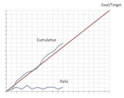
Red line graph
The pièce de résistance is the use of a red line graph. It is one of the most effective and easy-to-use management tools you'll ever come across. The red line graph visually displays the monthly target and how you’re doing every day for any stat you want to track. The red line graph is one of our most important statistic management systems, and all you need is a piece of graph paper.


