7 examples of beautiful dental websites, and what dentists can learn from them
UPDATED March 28, 2019
Your website should be the number one source of new patients for your practice. Is it? If not, learn how to grow your practice by following the best practices shown in these five real-world examples of beautifully designed dental websites.
In a previous DentistryIQ article, I wrote about the 7 most important pages on any dentist’s website. I’ve received a lot of great feedback on that article, including many requests for examples of great dental websites. Here I’ll share five examples of beautiful dental websites and explain how you can use each example to improve your own practice’s website.
What makes a beautiful dental website?
Beauty really is in the eye of the beholder. When putting this list of beautiful dental websites together, I asked:
• How does it look? While still a bit subjective, I was looking for good use of color, adherence to good web design principles (don’t worry, I’ll explain more about these as we go along), and my general impression of the design.
• How does it work? There’s a saying, “Form follows function.” That means beauty shouldn’t be a primary goal. Instead, esthetics should complement and enhance functionality.
• How does it benefit the end user? I focused on websites that provide clear answers to the questions website visitors and prospective dental patients might be asking.
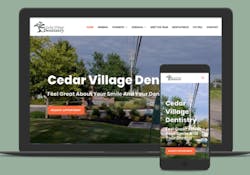
1. Cedar Village Dentistry
Mason, Ohio has a population of only 35,000 people. But it’s home to one of the most high-tech surgical dental practices in the country, Dr. Thomas Dooley’s Cedar Village Dentistry. The Cedar Village Dentistry website features original photography and videos highlighting the practice’s pro bono work and commitment to the surrounding community. Calming colors and simple explanations of complex procedures make this one of the best dental websites in 2018.
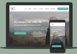
2. James Catt, DMD, PC
Oregon’s Rogue Valley is a surprisingly competitive dental market, with more dentists per capita than many major cities. How did Dr. James Catt use his website to set himself apart from the pack? By focusing on his experience, education, and certifications and awards from ASIRD, Invisalign, and the International College of Dentistry.
His website also helps uninsured patients learn their options to get the care they need. Delmain's research shows financial concerns are often at the root of a patient’s dental anxiety. Overcoming this goes a long way toward securing new-patient appointments.
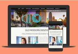
3. Glo Modern Dentistry
How does a dental website make a great first impression in a city known for an emphasis on cosmetics and beauty? Glo Modern Dentistry in Los Angeles uses their memorable brand and logo to connect with patients. Their homepage advertises a new-patient special for a signature whitening treatment.
But the site doesn’t simply focus on cosmetic care. An entire section of the site is devoted to explaining common dental health concerns. Delmain is seeing this type of educational content on many of the best dental websites, and for good reason. Patients must trust their dentist’s expertise, and these health-focused pages are an opportunity for dentists to show both their knowledge and unique approach to dentistry.
One tip for improvement—this site’s contact form asks for much more information than most dentists need. Research shows the more information you ask for, the fewer people who will complete the form. Think about what’s essential: name, phone number, and email. Then your front office staff can contact people to set up their appointments.
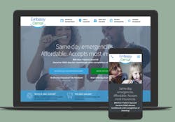
4. Embassy Dental
Embassy Dental’s unique approach to their navigation bar makes it stand out as one of the best dental website designs for 2018. Look how all the navigation items are associated with a memorable icon. At a glance, it’s easy to pick out where to click to schedule an appointment, learn about a doctor, or find a location.
In addition to the navigation, more icons highlight specialty services, smile galleries, and emergency dentistry. Clear calls to action encourage patients to schedule appointments or download new patient forms.
A suggestion for improvement would be to show more about the practice’s dentists, philosophy, and services on the homepage. This would help visitors to develop a deeper understanding of the practice without leaving the homepage.
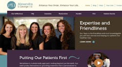
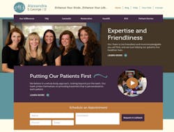
5. Alexandra S. George, DDS, LVIF
Here's a great dental practice homepage from the practice of Alexandra S. George, DDS, in Pittsburgh, Pennylvania.Delmain believes it's importanat to focus on what sets your practice apart. Dr. George places an image of her staff front and center on the homepage. The headline, “Expertise and Friendliness” helps frame visitors’ expectations: this isn’t just another drill-and-fill practice. The rest of the page is well laid out and visually pleasing. Visitors can schedule an appointment, read testimonials, learn about Dr. George’s services, and see blog posts, all without leaving the homepage.
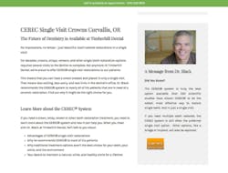
6. Timberhill Dental
Dr. Kurt Black of Timberhill Dental in Corvallis, Oregon, describes his practice as, “…a different kind of dental office with a high-tech, high-touch approach to dentistry.” His service pages, like the one here for CEREC single visit crowns, are among the most effective that I’ve seen.
Scroll through the page (or any of his practice’s service pages) and you’ll see how he focuses not only on the details of the service, but how he:
• Offers a quick and concise explanation of each service in his own words.
• Explains the spa-like amenities his practice is known for.
• Highlights testimonials (with pictures) from very happy patients.
• Uses tables and comparison charts that make it easy for readers to skim the page.
It's important to find a layout and style that works for you, and stick to it.Each of Timberhill Dental’s service pages follow the same basic layout. When visitors browse different pages, the experience remains consistent. Changing the style of your services pages confuses visitors and makes it harder for them to learn about your practice.
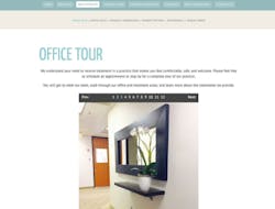
7. Dallas Dental Arts
The Dallas Dental Spa, owned by Sheena Allen, DMD, and Lorin Berland, DDS, has a great set of pages designed to attract new patients. How do they do it so effectively? The Office Tour page (pictured here) is a great way to introduce patients to the practice. Between the practice’s name and the beautifully designed office, it’s clear that esthetics, design, and beauty matter to these dentists. The patients this modern practice wants to attract will be more engaged by these images than pages that are heavy on text.
Know your audience and design your site with them in mind. Are you looking for patients interested in high-end cosmetic services, families with young children, budget-conscious college students, or senior citizens who need extensive dental treatments? Focus on the website content and design elements that will appeal to the patients you want to attract. For example, if many of your patients are older, consider increasing the text size on your website to make it easier for them to read.
Where to go next?
I hope that seeing real-world examples of beautiful dental websites will inspire you to think more about your own website. Ask yourself about the value your site adds to your practice and the information it provides to your patients.
Next steps
1. Start taking notes about the websites you visit. What can you learn from them and apply to your own website?
2. Take a critical look at your own website. If you could start over, what would you do differently based on what you’ve learned?
3. Finally, I challenge you to make one change to your practice’s website. It could be as simple as adding your own voice to your service pages or making your contact page more mobile friendly. If you rise to the occasion, leave a comment here and tell me about it!
And me?I’ll be keeping my eye out for more great examples of beautiful dental website design. I’ll be featuring them and sharing more valuable takeaways here on DentistryIQ.